Overview
The case study is about how I conducted a UX governance for a dashboard design.
The Problem Nature
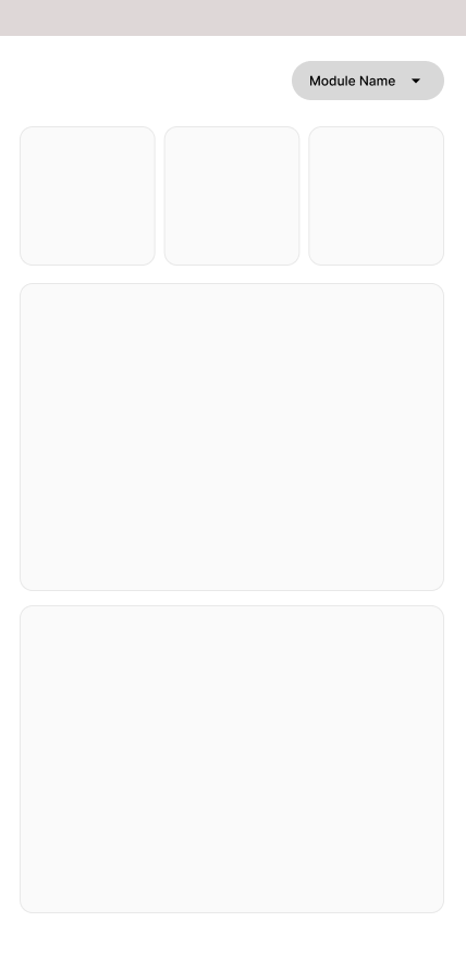
This relevant SaaS application had many modules. Since it has many modules, there were a lot of KPIs for each module.
When it comes to the mobile application to show as many KPIs possible, the application had separate dashboards for each module. It had a switch on the dashboard page where it will be showing a specific dashboard for each module. The problem was that when there were many modules coming in and out, the user had to switch in between a lot of modules.
So in order to tackle that, the idea was to bring a unified dashboard for the application. But the problem was if we were to bring out a unified dashboard, we had to decide what should go on the dashboard and what should not.
Approach Comparison
- Deep focus inside one module, clear context for power users.
- High cognitive switching cost between modules.
- Mobile users feel discoverability drop and lose flow.
- No holistic picture, managers can’t answer “what needs my attention today?”
- Instant value on entry, user opens app and sees what matters now.
- Reduces cognitive load and removes “where do I go?”
- Reflects real cross-module workflows, not system architecture.
- Requires UX governance to decide what earns a spot and what gets buried.
The Process of Governing the Dashboard Insights
Analyze the existing application and Note Down all the KPIs and Insights we have so far.
- Insight 01
- Insight 02
- Insight 03
- Insight 04
- Insight 05
- Insight 06
- Insight 07
- Insight 08
- Insight 09
- Insight 10
- Insight 11
- Insight 12
- Insight 13
- Insight 14
- Insight 15
- Insight 16
- Insight 17
- Insight 18
Then my target was to filter the need for each current insight. To identify the need, Before that I needed to understand the mobile application users. The next stage was to create mobile user personas.
Mobile User Personas
Customer Name
- 23
- Business Analyst
- Colombo
General Employee with 4-5 years experience
“Did my leave get approved?” “Do I need to sign something?” “Is there anything blocking my work?” “Let me quickly check and close this.”
I’m here because something needs attention, or I have 30 seconds.
Tell me what’s pending, let me finish it fast, and let me leave the app.
Time to completion under 60 seconds
Closure for actions not insights
Action Oriented
Customer Name
- 40
- HR Manager
- Colombo
Senior HR manager focuses on operations
“Do I need to approve something?” “Is someone blocked waiting on me?” “Did something urgent come in?” “Let me clear this before my next meeting.”
I’m here because something needs attention, or I have 30 seconds.
Priority surfaced clearly, Fast decision-making, Pending approvals, Clear context (just enough) Bulk or quick actions
Zero missed approvals or actions + fast turnaround
Closure for actions not insgihts
Action Oriented
Findings & Filtering
Findings were that mobile users of the SaaS application do not use the mobile app as their operational gateway but rather for emergency and quick access. They use it either to get updated on something quick or perform something quick. Even for decision making it is for quick and upfront decisions rather than analytical and comparison decisions.
Mobile dashboard insight either should be:
- Help in completing a task
- Help in making decision
- Help in confirming a status
Next stage was to omit the insights from current list which are:
- Charts (Ex: Distribution)
- Analytical & Historical Data (Monthly Utilization)
- Trends
Then I was left with a set of current remaining insights.
Mood Board & Categorization
I went through a couple applications in the same domain and created a mood board of mobile home pages.
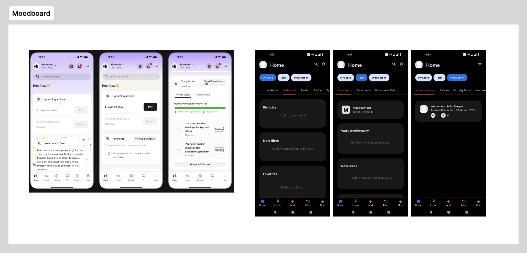
Listed down insights that may be relevant to our users and serves the purpose of task, decision or status. The combined collection of insights were categorized.
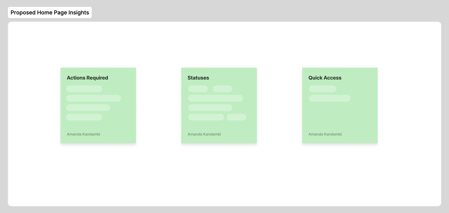
Now it was about governing these insights; what should go on the dashboard and what not.
Governance Approach
I selected 7 users which variety of access levels; Super Admin, Manager, general users (These are user level in applications).
| User Name | Occupation | User Type | Demographic | How Often Do you use |
|---|---|---|---|---|
| User 01 | — | Admin | General User | Only When needed |
| User 02 | — | Supervisor for less than 3 employees | General User | Daily |
| User 03 | — | Supervisor for less than 1-5 employees | General User | Only When needed |
| User 04 | — | Supervisor for more than 5 memebers and multiple teams | General User | Only When needed |
| User 05 | — | Admin | Power User | Only When needed |
| User 06 | — | Supervisor for less than 1-5 employees | Power User | Only When needed |
| User 07 | — | Supervisor for less than 3 employees | General User | Only When needed |
Data Collection
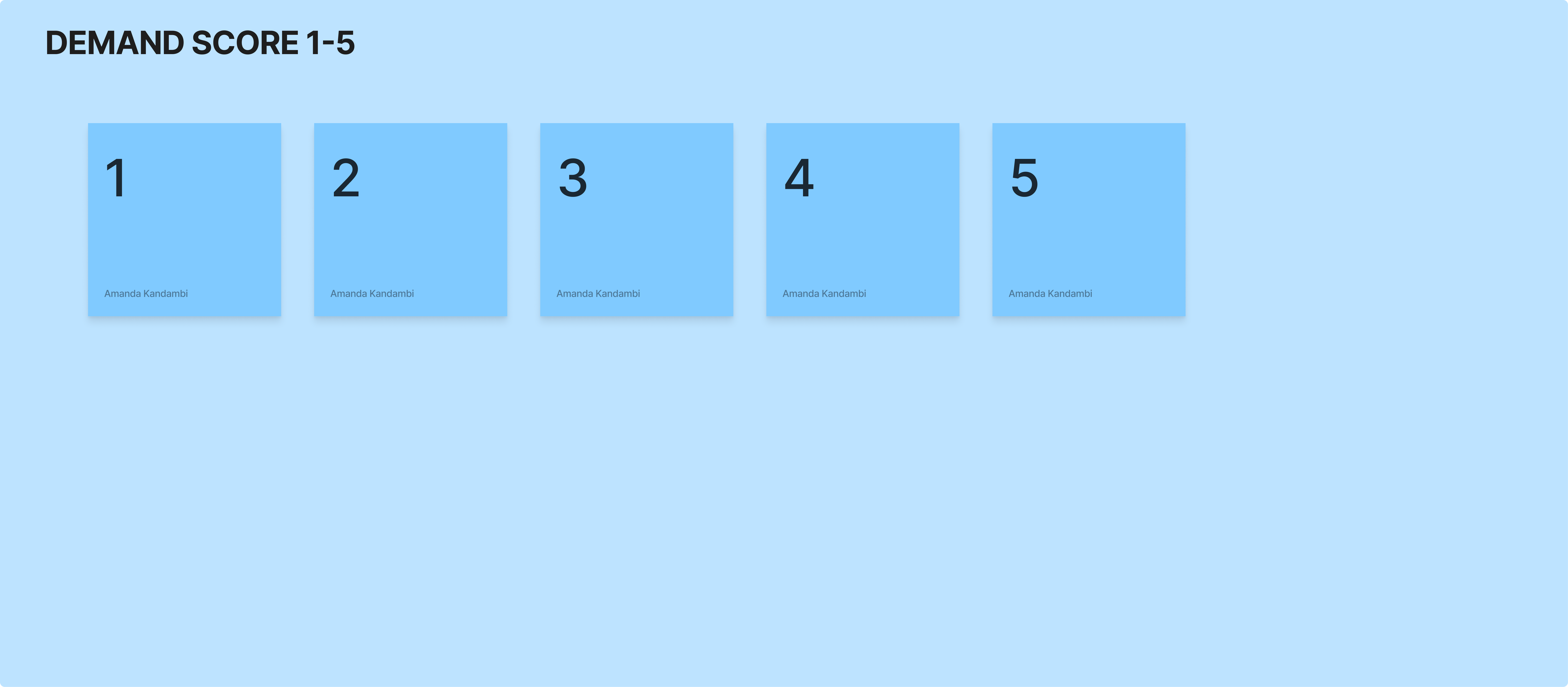
For data collection I used a tool called Userberry. The method of user data collocation was: I created a template for validating the need for insight. For each insight three sets of data were captured:
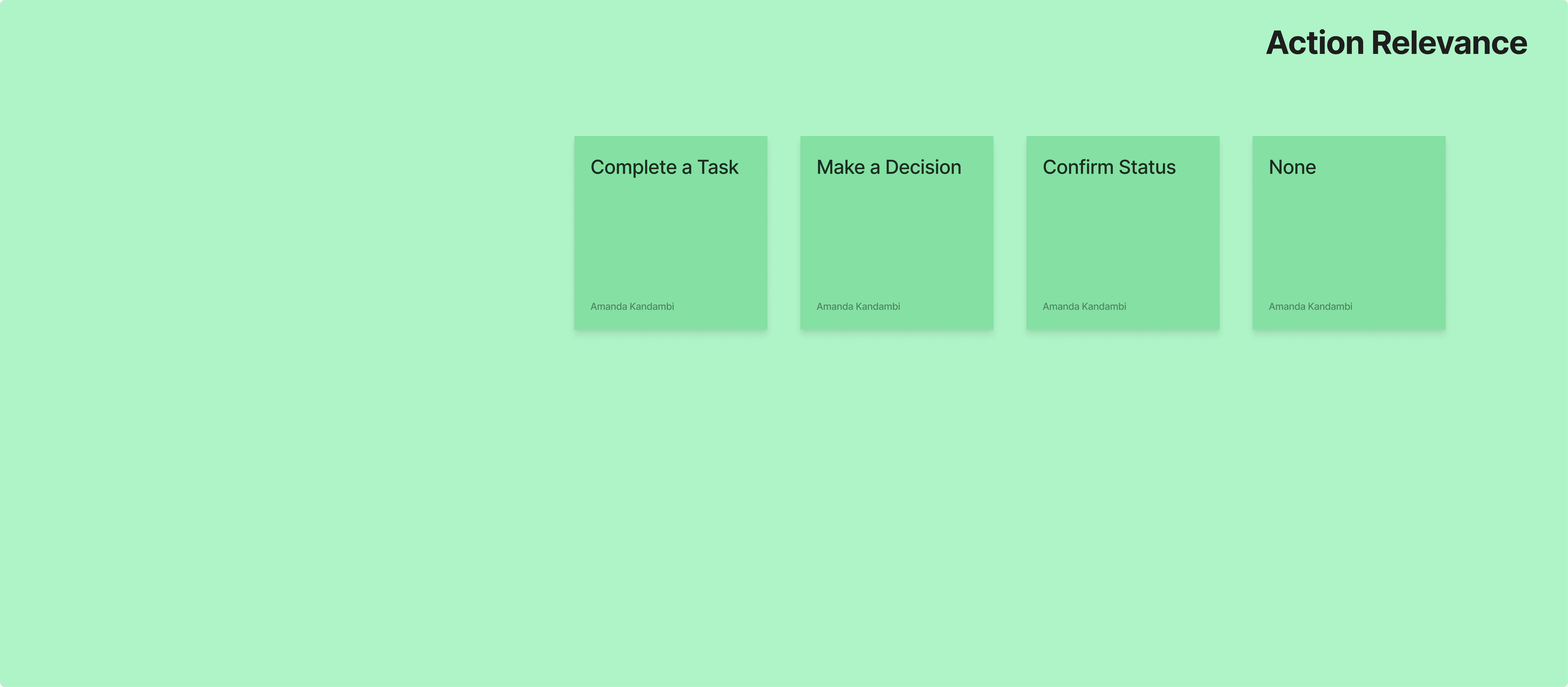
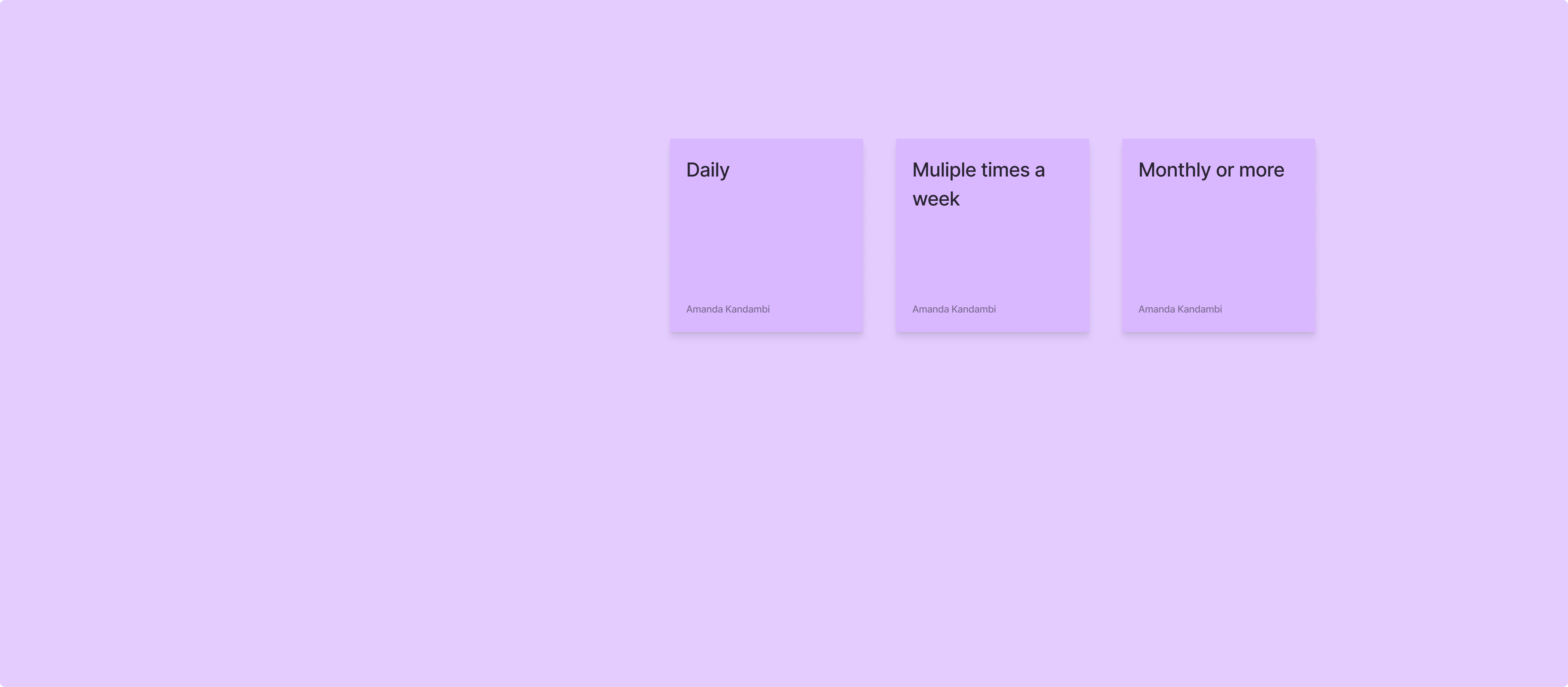
Conducting User Interviews
1on1 interviews for 20 mins online. Users were given the test through the useberry link. Explained why we collect these data and what for. Then they proceeded with answering questions and lastly their free comments.
How I Made Decisions From Derived Data
For primary validation I reviewed the demand score and marked (Positive, Negative and Mixed)
- · If 4 or more users are in the positive range then the insights were marked as positive.
- · If 4 or more in the negative range then the insights were marked as negative.
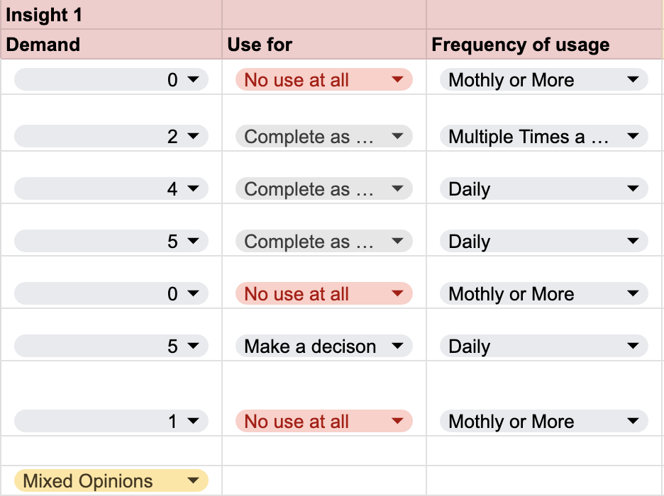
- · If answers were mixed it was marked as mixed opinions.
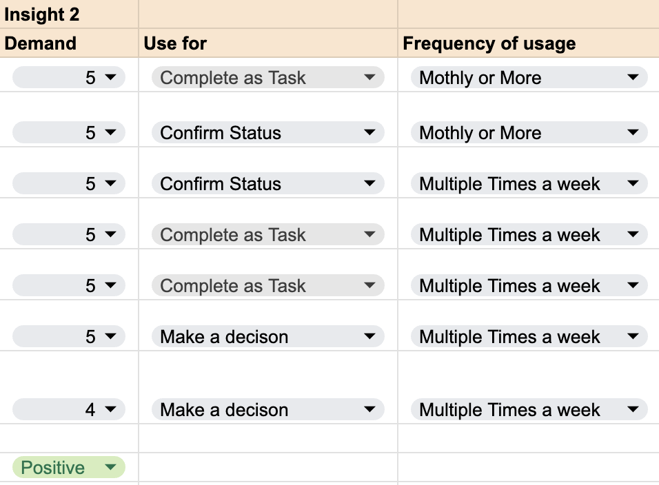
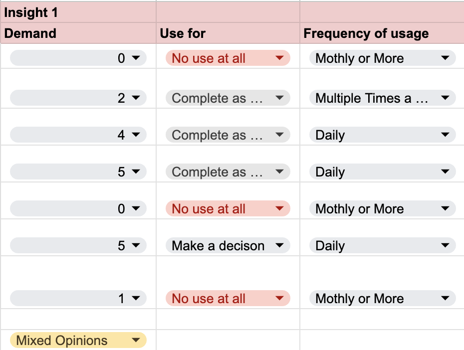
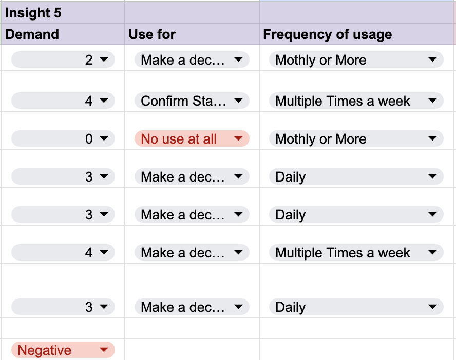
Negative ones were removed from insights but if it was helping in any type of usage it was considered again. Same for the mixed ones, they were added to the insight list upon user comments considerations.
Mixed-Opinion Example
There was an insight where users answered with mixed opinions. But summarizing user comments was able to be understood. There were mixed opinions since for that specific organization they did not have a process relevant to the insight. So that insight was tested with a set of groups from different organizations for more accurate data.
Wrapping Up
Once the insights to go on the dashboard were finalized, the governance wrapped up. Then the task was to decide on the structure of the insight widgets, information architecture of home page and hierarchy and placements of widgets so that user is able to utilize the insights as they were intended to be used.
This scope covers my experience in conducting testing to govern UX decisions.